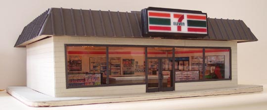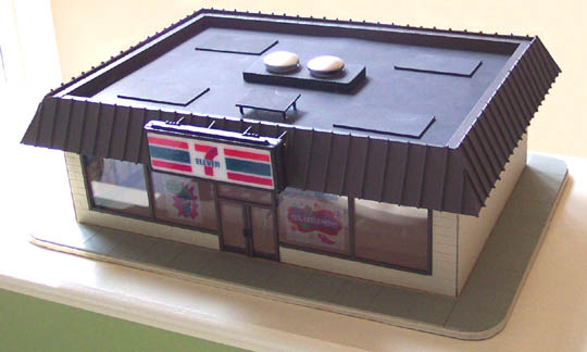
After completing my first two downtown buildings, I decided to give a hand at trying to make a model 7-Eleven. At first I thought that the only really challenging part would be the roof, which as you can see is a standard annodized aluminum siding with the classic raised runes running vertically down each side. But I had already made three similar pented-style roofs for my second office building, so I figured this would be very similar, except that the sides are less slanted (more vertical).
I actually only got motivated to build this thing when I noticed a spray can of "annodized bronze" at Home Depot. When I looked carefully at the color, it was a kind of very dark brown - black, really, with a hint of brown in it. This is the actual color of annodized aluminum - the stuff used for the window trim around modern commercial buildings such as the one modeled here. It's also the color of the roof sides
I was mostly right: this thing went pretty fast at the beginning. I used cold-press illustration board ("matteboard") for almost the entire exterior, including the walls, roof sides, and roof top. One extra detail I added is I used an X-Acto blade to etch brick detailing into the exterior walls. This really took a lot of time, though, and if I ever make something like this again I will either use cast pieces with the brick pattern already etched in, or I will simply cut horizontal etches to simulate siding.
What I realized half-way through it, however, is that in order to look like a real 7-Eleven, I would need to use clear plexiglas for the front store window. What I have always done for my other layout models is use a foggy Mylar material for the windows, which allows the interior light to illuminate the window, but does not allow you to look in and see any interior details (or lack thereof). To do this to the 7-Eleven would render it entirely unconvincing, no matter how I tried to rationalize it.
So once I realized that I needed a clear glass for the front store window, I then realized in horror that I would have to at least partially finish the interior. What followed was some rather comical visits to the local 7-Eleven stores with my digital camera. Taking pictures of the insides of a 7-Eleven is odd enough without having to make special spacial adjustments to compensate for the camera's lack of a wide-angle lens. I needed at least a few shots of glass refrigerator doors, at least a couple shots of the racks of snacks, and of course the quintessential Slurpee and Big Gulp fountain soda dispensers.
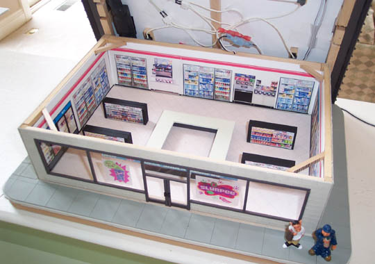
Once I gathered these, as well as a picture of the exterior sign, I cleaned them up in Photoshop, and scaled them down to the proper dimensions. Then I printed the images out onto white self-adhesive label medium, and trimmed the stickers down to size, and mounted them directly onto the interior walls. The entire perimeter of the store is just flat imagery done in this manner. You can see this plainly when looking into the store from the top with the roof removed. But with the roof on, and looking into the front window, the effect is much more realistic, and satisfied me.
What helps is the counter, and the four "snack racks" mounted in the floor. These are just rectangular cubes of wood painted black with more photo-stickers of snacks mounted on them. These elements add depth to the scene when looking straight into the front window, and this helps lend credibility to the "flatness" of the wall images.
Another thing that helps is the transparent stickers that were mounted on the front store window. These advertisements also obscure a little of the interior detailing, making it just a little more difficult for your eyes to discern the truth about the details inside.
Late in creating this model, I started flirting with the idea of making the exterior sign actually illuminate like the real thing. The bright, familiar 7-Eleven sign over the top of the front really characterizes the store, and would make for especially appealing night-time scenes.
But creating this kind of sign is one of the hardest things to accomplish in scale modeling. The real thing lights up like a big, flat, white light panel, with the image of the sign on the surface nicely illuminated evenly throughout the whole area of the sign. To accomplish this, I knew I needed to find an ideal plastic jewel case that would allow me to open and close it in the future to replace light bulbs. This case could then be painted black except for the front panel, and then I could insert little lights into the bottom. Then, I just had to print a 7-Eleven sign on transparency film, and mount it on the front and I'd have the beginnings of something workable.
What you see in these pictures is what resulted. The jewel case came from a kind of dental floss available at most grocery stores. Using this hinged plastic case allows me to replace expired light bulbs without having to do major surgery to the model. To get the best "glow" from the sign, I ended up having to install seven micro lights (from Miniatronics) evenly spaced apart to give the sign its "illuminated light panel" effect. It came out better than I expected. Finding the right light bulbs for this proved to be the hardest part, since they had to be bright, very small to fit into the slim profile of the sign, and they also had to burn cool enough to not cause heat problems in the plastic case (i.e. melting).
The next challenge came when trying to light up the interior. My first attempt involved mounting four standard mini incandescent bulbs into the ceiling. This was far too dim. Real convenience stores like this have very bright, flourescent lights which illuminate the store to almost direct-sunlight levels. I experimented with more light bulbs of the same kind, but this still did not achieve what I was looking for.
Enter Miller Engineering. These guys make the perfect solution to this problem - a miniature flourescent light fixture, which exhibits very much the same light casting ability as real flourescents. Although pricey (a set of 2, eight-inch tubes costs $25, which does not include the necessary power adapter), the lighting ability of these things may be worth it.
The end result is, like all my buildings, highly stylized. Taking a close look at the details will immediately let you know that it is a model. But standing back a few feet and looking at it in place on a layout with other similarly-styled model buildings yields a fairly realistic impression.
1 comment:
Hi,
My name is Michael Hayes.
I'd like to inquire about a potential sponsorship for your site, if you could include a link to my site from you "Sites Referenced" sidebar.
Please advise if this is possible.
Regards,
Michael Hayes
hayes_michael_d@yahoo.com
Post a Comment