Wednesday, April 7, 2010

September 2009 Build : Windmill


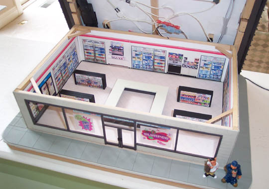
When the votes were finally tallied in August, the windmill won the honor of being the September Token Build. While many voted, three brave builders decided to tackle the challenge. David Baran, Jim M, and Vulcan all completed their builds and have agreed to share pictures of their progress here on the blog. While admiring their unique choices, and building expertise, its our hope as Token Builders that you can take some ideas and techniques home with you and use them on your own build.

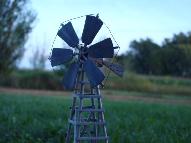
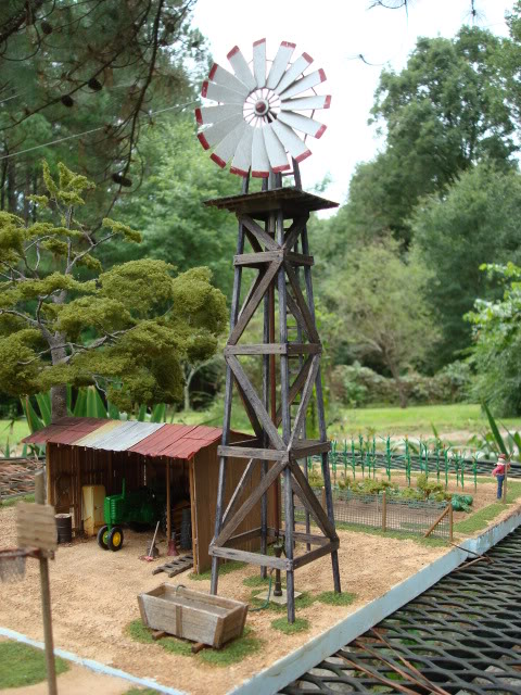
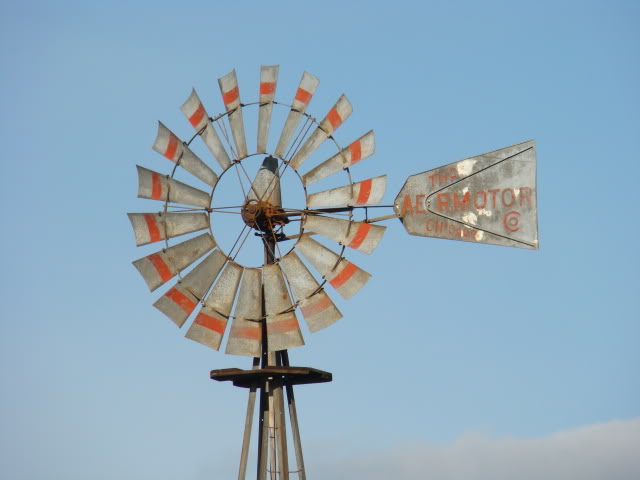
As with most scratch-builds, the modelers first had to choose a prototype to model. Here in southern Texas, windmills are everywhere. Many are smaller than I had imagined they would be and served to bring water up from wells to troughs for livestock. I had always thought their was one standard windmill, but a quick image search on the internet came up with many different styles of windmills located throughout the country. Each participant chose one that best suited the style they were looking for and began their builds.

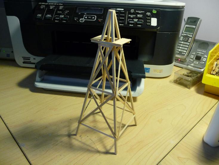
First, the modelers had to build the support structure for the windmills. All the different builds had this part in common as there didnt seem to be many styles that diveated from the norm. In most cases, a template was used to help keep things centered and squared.

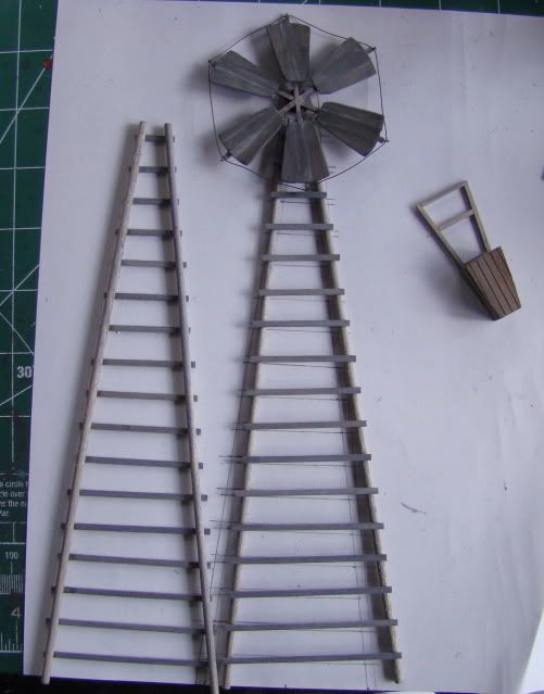
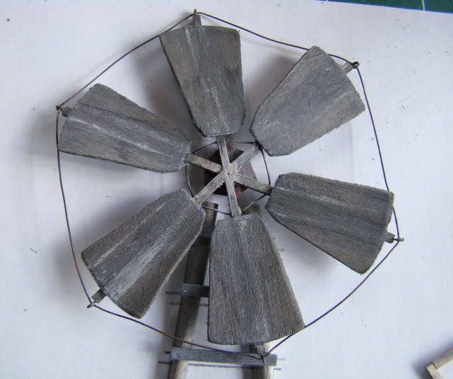
Next came the most recognizable feature of all windmills: the blades. This would also be the most difficult and time consuming part of the build. Not only did the blades have to be cut out individually, but they also had to be arranged in a symmetrical pattern, evenly spaced, and at a slight angle in order to spin in the wind. Once again, each modeler chose their own technique to manufacture this part of the build. As you can see, their patience and skill paid off.

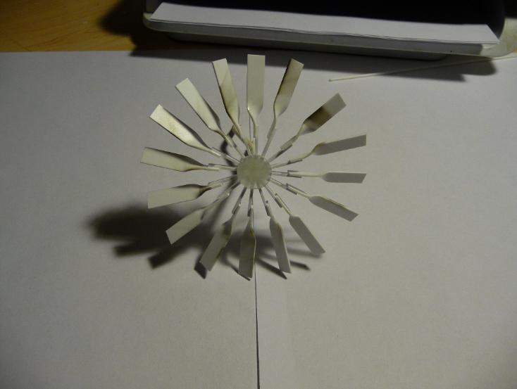
With the appropriate weathering and paint applied, the builds were ready to be photographed for their debuts on the OGRR forum's Scenery Section. Soon they found places on their owner's layouts and will forever be posted here for others to admire and learn from. As with every post here on the Token Three Railer, we thank the modelers who participated and hope to see more from them on future builds. And if you are up for a healthy dose of scratch-building fun, check out the latest Token Poll and see if one of the choices might be of interest to you. The community of modelers associated with this blog are anxious to see your work!

Monday, March 29, 2010

Bottle Making with Vulcan

I had been working on a bar interior and of course it wouldn't be a bar without liquor bottles, so...... Here's how I am making the liquor bottles. Starting with these small glass beads, they can be found at any craft store.

Photobucket

Photobucket

I first pick out appropriate colors, clear for Vodka and Gin. I like the orange-ish looking ones for Bourbon, whiskey, etc. I then insert a piece of 30 mil fiber optic cable. The ID of the beads is almost a perfect match to the OD of the cable, on most it's a very tight fit, so I need to use no glue.

Photobucket

I then cut the cable so that the overall height of the bottle is 1/4" (a scale 12", using a wine bottle for this reference). Then insert a round toothpick into the other end, as a holder. I spread a bead of Testors Clear parts cement around the base of the neck to form a shoulder.

Photobucket

When that has set up, if no other painting is needed (I painted a couple of the bottles Jade Green for wine bottles) I paint the tip of the Fiber optic to represent a cap. Black, brown, maroon, gold, etc. Then apply the labels. The labels are printed on label stock, this eases the attachment greatly.

Photobucket

Photobucket

Sunday, October 25, 2009

Modeling the 7-11 : JohnBoy


After completing my first two downtown buildings, I decided to give a hand at trying to make a model 7-Eleven. At first I thought that the only really challenging part would be the roof, which as you can see is a standard annodized aluminum siding with the classic raised runes running vertically down each side. But I had already made three similar pented-style roofs for my second office building, so I figured this would be very similar, except that the sides are less slanted (more vertical).


I actually only got motivated to build this thing when I noticed a spray can of "annodized bronze" at Home Depot. When I looked carefully at the color, it was a kind of very dark brown - black, really, with a hint of brown in it. This is the actual color of annodized aluminum - the stuff used for the window trim around modern commercial buildings such as the one modeled here. It's also the color of the roof sides


I was mostly right: this thing went pretty fast at the beginning. I used cold-press illustration board ("matteboard") for almost the entire exterior, including the walls, roof sides, and roof top. One extra detail I added is I used an X-Acto blade to etch brick detailing into the exterior walls. This really took a lot of time, though, and if I ever make something like this again I will either use cast pieces with the brick pattern already etched in, or I will simply cut horizontal etches to simulate siding.


What I realized half-way through it, however, is that in order to look like a real 7-Eleven, I would need to use clear plexiglas for the front store window. What I have always done for my other layout models is use a foggy Mylar material for the windows, which allows the interior light to illuminate the window, but does not allow you to look in and see any interior details (or lack thereof). To do this to the 7-Eleven would render it entirely unconvincing, no matter how I tried to rationalize it.


So once I realized that I needed a clear glass for the front store window, I then realized in horror that I would have to at least partially finish the interior. What followed was some rather comical visits to the local 7-Eleven stores with my digital camera. Taking pictures of the insides of a 7-Eleven is odd enough without having to make special spacial adjustments to compensate for the camera's lack of a wide-angle lens. I needed at least a few shots of glass refrigerator doors, at least a couple shots of the racks of snacks, and of course the quintessential Slurpee and Big Gulp fountain soda dispensers.

Once I gathered these, as well as a picture of the exterior sign, I cleaned them up in Photoshop, and scaled them down to the proper dimensions. Then I printed the images out onto white self-adhesive label medium, and trimmed the stickers down to size, and mounted them directly onto the interior walls. The entire perimeter of the store is just flat imagery done in this manner. You can see this plainly when looking into the store from the top with the roof removed. But with the roof on, and looking into the front window, the effect is much more realistic, and satisfied me.

What helps is the counter, and the four "snack racks" mounted in the floor. These are just rectangular cubes of wood painted black with more photo-stickers of snacks mounted on them. These elements add depth to the scene when looking straight into the front window, and this helps lend credibility to the "flatness" of the wall images.

Another thing that helps is the transparent stickers that were mounted on the front store window. These advertisements also obscure a little of the interior detailing, making it just a little more difficult for your eyes to discern the truth about the details inside.

Late in creating this model, I started flirting with the idea of making the exterior sign actually illuminate like the real thing. The bright, familiar 7-Eleven sign over the top of the front really characterizes the store, and would make for especially appealing night-time scenes.

But creating this kind of sign is one of the hardest things to accomplish in scale modeling. The real thing lights up like a big, flat, white light panel, with the image of the sign on the surface nicely illuminated evenly throughout the whole area of the sign. To accomplish this, I knew I needed to find an ideal plastic jewel case that would allow me to open and close it in the future to replace light bulbs. This case could then be painted black except for the front panel, and then I could insert little lights into the bottom. Then, I just had to print a 7-Eleven sign on transparency film, and mount it on the front and I'd have the beginnings of something workable.

What you see in these pictures is what resulted. The jewel case came from a kind of dental floss available at most grocery stores. Using this hinged plastic case allows me to replace expired light bulbs without having to do major surgery to the model. To get the best "glow" from the sign, I ended up having to install seven micro lights (from Miniatronics) evenly spaced apart to give the sign its "illuminated light panel" effect. It came out better than I expected. Finding the right light bulbs for this proved to be the hardest part, since they had to be bright, very small to fit into the slim profile of the sign, and they also had to burn cool enough to not cause heat problems in the plastic case (i.e. melting).

The next challenge came when trying to light up the interior. My first attempt involved mounting four standard mini incandescent bulbs into the ceiling. This was far too dim. Real convenience stores like this have very bright, flourescent lights which illuminate the store to almost direct-sunlight levels. I experimented with more light bulbs of the same kind, but this still did not achieve what I was looking for.


Enter Miller Engineering. These guys make the perfect solution to this problem - a miniature flourescent light fixture, which exhibits very much the same light casting ability as real flourescents. Although pricey (a set of 2, eight-inch tubes costs $25, which does not include the necessary power adapter), the lighting ability of these things may be worth it.

The end result is, like all my buildings, highly stylized. Taking a close look at the details will immediately let you know that it is a model. But standing back a few feet and looking at it in place on a layout with other similarly-styled model buildings yields a fairly realistic impression.

Tuesday, December 9, 2008

Weathering Track

Here is the answer to the long asked question as to how I weather my track.

I weather my track with Poly Scale paint and it is in their Military color line. It only comes in the 1/2oz. bottles and is called Imperial Japanese Army
Brown (FS 30108)505276)


I airbrush the rails sides with it and then wipe the rail head before the paint dries. I use a piece of cardboard behind each rail as I am spraying the rails sides. I also airbrush the ties with RR tie brown also made by Poly Scale. Once the paint has dried. I go back and give a wash with watered down grimy black here & there to vary the color a bit. I also use Bragdon's weathering powders and use a dark gray or black and dust the ties in the center between the rails to give a grungy/ dirty look to some areas. Here is the finished look. Thanks for looking!


Friday, September 12, 2008

Stone Flower Bed How-To .... A Build by: Catch-22


Here is how I made the stone flower beds ... First, the supplies I used:


From left to right - Short Prairie Tufts - Late Summer - Made by Miniatur, Woodland Scenics Bushes Clump Foliage, Rust-Oleum Light Gray Auto Primer, Spray "Glue For Glitter", White Glue, White Apple Barrel acrylic paint, burnt umber, black and raw umber acrylic paints from Woodland Scenics, a #1 round paint brush, a #6 shader brush, and two containers of washable paints I borrowed from my kids.

Not shown is the remnant of linoleum, container of dried coffee grounds or the container of Scenic Express fine grass foam.

Getting Started:

Decide how big you want your flower garden to be, and create a pattern out of paper. Then, cut out the number of squares/rectangles you desire, depending on how high you want your flower bed to be. I used a total of 5 (counting the top) which made the scale height 2'.


Once you cut out your squares/rectangles, notch out the sides simply using the point of a scissors and make tiny triangles:


When you make your notches, try and make them in different spots on each "tile", that way they don't line up when you stack them:


For the top piece, cut out a square/rectangle that is slightly larger than the others you cut out, and depending how wide a top you want, cut out the center:


I scored the top of the flower bed to make it look like larger stones were used. You can make them as large or small as you like. Then, apply white glue and line them up. Be sure that the "overhang" of the top piece is equal the whole way around. Also, it's best when stacking to put the textured side up.


Once that's dry, use the light gray primer and give each side and the top a quick spray. Stay far enough away that the primer just barely hits it. The idea is to not get it that heavy that you lose the natural porous look that the linoleum gives you.


The primer dries very quickly, so within 20 minutes I was ready for the first of 3 black washes that I applied. I used the black acrylic paint and made a wash that was equal parts water to paint. Using the #6 shader brush, I coated the entire piece with the black wash. I dabbed the top and sides each time with a paper towel, just to remove excess.


After the third black wash was dried, I used washes of the same concentration of the burnt umber and raw umber. However, for this application I used the #1 round brush. It has a fine tip, and I randomly selected the sides of different "stones" to touch with the tip of the brush. I also dabbed a little here and there on the top stone too:


Once those washes dry, it was time to dry brush some white at various spots. Simply do what looks best to you. Then, I was ready to add some Scenic Express grass to the sides to simulate moss growing up the sides. I used a spare piece of white foam core as my pallet, and I diluted about 3-4 drops of white glue with some water with my #1 round brush. I used the tip of the brush to push the watered down glue into the cracks where I wanted the mold to be. I then used my fingers to press the grass turf into the rocks. This is a nice way to cover up any areas also where the black wash turned out to be too dark.


Next it was time for the mulch in the center. I coated the inside with white glue, using my #1 round brush to be sure to get in all the corners. I sprinkled dried out coffee grounds (baked them in the oven to be sure they were dried). After that was dry, I shook off the excess. You can leave it alone at this point, but I sprinkled some more coffee on for more depth, and then I gave it a few quick shots of the "Glue for Glitter" spray to set it. It dries within minutes.


The last thing is the bushes. You can use whatever you want for this, but for the 2nd one I made here, I only used small pieces of Woodland Scenics Bushes Clump Foliage. I sifted through the pieces and found some that were close in size, and I put a drop of full strength white glue on top of the mulch where I wanted them. When they were dried, I used my #1 round brush again, and I watered down, on my pallet, the colors that I wanted to make my flower blooms. In this case, white, pink and purple. I put a few drops of water on my pallet, dipped the brush into the paint, and then mixed it with the water on the pallet. Once the brush was loaded up, I lightly grazed the bushes with the tip of the brush, and you have flowers!


This is very easy to do and the possibilities for using the method to make walls, etc. using the tiles are endless.

Sunday, August 17, 2008

A Simple Mikado Jr. Makeover . . . by 49Lionel


Like many three-railers, I work within a limited space and budget, so when Lionel came out with its Mikado Jr., I was immediately interested. Visually, it is clearly based on a USRA light Mikado:


The Lionel designers did a great job shrinking it down to operate on O-27 curves, keeping it well-detailed but also durable and easy to handle, much like the best locomotives from the postwar era. A few things about its appearance did bother me, in particular the front end looked a little plain. Most railroads that used the USRA light Mikes either put the headlight at the top of the smokebox and the bell farther back on the boiler (as did the PRR), or centered the headlight with the bell at the top, but here the centered headlight and boiler-mounted bell didn’t look right. Also, the pilot deck is a little spartan, and the coupler… well, it is not the most inspired part of the model. I decided that I could cheaply and easily made a few additions that would greatly enhance the model’s look.

First was the issue of the bell. Since I could clearly not relocate the headlight, I decided to go for a front-mounted bell arrangement. Lionel used a smokebox-mounted bell on the Union Pacific version from the initial release year, but all current versions use a boiler-mounted bell, so I purchased the UP boiler front. The downside to this approach is the wrong numbers are now on the engine’s front. Perhaps a better solution would be to use a bell from a detail parts source, and mount it by drilling a hole in the original smokebox front, but of course that would be a non-reversible alteration.

Once I got the new boiler front, I realized that a few more things about it could be improved: first, I painted the sides of the marker lights, the headlight, and the cast-in grab rail black. Clearly, the whole part was painted in graphite for economy, and the small amount of detail-painting really helped the appearance. Second, I figured that the headlight would look much nicer with a visor. The metal from a soup can would work perfectly for this purpose: it’s durable, the right thickness, and can easily be cut with a pair of shears. After making a trial visor out of thin cardboard, I traced its outline on the metal and trimmed. I found a screwdriver whose shaft was the same diameter as the headlight: it would serve perfectly as a mandrel. After I had the part trimmed and shaped to my satisfaction, I affixed it to the headlight housing (with lens temporarily removed) with Crazy Glue. After touching up the top with black paint, the part was ready to me mounted.

With the bell now up front, I had to remove the bell from the boiler top. Getting it out was the easy part: just a tap from below and it popped right out. Now, there was a hole left in the boiler top that would need to be filled it and painted. It was easy to fill it in with JB-Weld, but touching up the paint would be trickier. This model is painted in Brunswick green, so I would have to replicate that color. I mixed a very small amount of Testor’s green into black until I found the right hue, and applied the paint, but there was no way I could make it look even with the factory-applied paint. I found that if I waited until the paint was nearly dry, covered it with wax paper and then ran my fingernail over it, I could smooth it out to look halfway decent. In most lighting conditions it’s not even apparent:


Next, I wanted to add coupler lift-bar and grab iron detail that was missing from the pilot deck. For the coupler lift bar I ordered a part from Lionel’s Docksider, and for the grab iron I ordered stanchions from the Atlas 0-6-0 and connected them with a straightened paper clip! I took great care in drilling the holes for these stanchions (six in total), since they had to be perfectly positioned.

After the holes were drilled and cleaned I affixed the stanchions with Crazy Glue.

Although I decided to retain the shiny metal handrails along the boiler, I painted the pilot supports black (with Krylon semi-flat black). Finally, the pilot needed was a simulated air hose. Unable to locate a detail part, I shaped mine from an Easter egg dipper! The finished front end:


If I was more ambitious (and skilled), I would have cut off the simulated coupler and installed one with a more scale-like appearance. These are fairly easy to locate, so the project would take more skill and time than money.

One thing that has always bothered me about many 3-rail steamers is the position of the eccentric crank on the fireman’s side: it is often placed leaning back toward the cab (with rods down), with the other one leaning forward (the more usual position, and prototypical for this engine). I simply filed off the fingers that hold the crank into the driver, and held it in its new position as I re-tightened the screw.

To improve the somewhat flat appearance of the Brunswick Green paint, I rubbed it with WD-40 (avoiding the smokebox and firebox). Last, I added a non-operational back-up light on the tender deck, also from the Atlas 0-6-0. Its side numbers were printed on photo paper and glued into place. I’m sure some readers would be able to add illumination. Likewise, it might be nice to add rear marker lights.

Finally, a before-and-after comparison:


I hope that this project will encourage readers to take on similar projects of their own.

Wednesday, August 13, 2008

Detailing Brick and Mortar Work on Plastic Structures


Since my first attempt detailing a Walthers Cornerstone Build Up several months ago, I decided to give it another try using some of the lessons learned not only from that first attempt, but those also gleaned from the generous and timely advice I have received both here and from other sources on the internet. Below you will see a picture of the supplies I used for this project. All should be available at any neighborhood hardware store and art supply.


The first step is to spray paint the entire structure a flat white. I have always used Flat White Gesso in a can, but I'm sure another version of flat white would probably work just as well. I learned from my first build that working directly on plastic causes a number of issues: the most important of which is that paint just doesn't stick very well to the bare plastic ... tends not to adhere and comes off easily. The undercoat of flat white provides a base that color sticks to much better. Please note that it is not advisable or practical to get a thick coat on ... just enough to provide some tack for the brick colors to stick to. Also, too much paint will cause the mortar lines in the bricks to be less pronounced, causing issues further down the line when adding mortar.


That white, although dull, is still a bit too strong. Using a mix of brown (or black if you wish) india ink and alcohol give the white-walls two thorough washes. No need to be neat and tidy, just get it on there. Not much of a difference, but it is noticeable as you can clearly tell from the picture.

Using the darkest of the three colors, randomly chose bricks for the darker bricks. I think no more than five per horizontal line of bricks works well for me, though its totally up to you how many you wish. Here is a picture of the darker bricks in my build.


Now, going with the middle shade for the bricks (and the most numerous) fill in the blanks. This should go pretty smoothly and easily as you can just put the marker down and 'draw' the lines on. Keep in mind that you should leave a number of bricks per horizontal line free and un-markered for the lighter shade of bricks. Like the last step with the darker shade, leave four or five bricks per line untouched as seen in the picture below.


Next, using the lightest shade of brick color you have chosen, hit up those remaining bricks. Also, to further enhance the variety of bricks coloring, chose a few bricks to hit again with the marker. One more pass on individual bricks will darken the color slightly, just enough so that it stands out a bit. The overall effect of this will become evident once you finish the marker routine.

I have had some trouble with these markers staying put during the later stages of this build (ink wash and mortar work). It is advisable to spray the entire model with dull coat to seal the marker coloring in. A very important step, and one that will save much heart-ache in the end. Please note that there may be some bubbling and / or discoloration after spraying with the dull coat. For that reason, don't overdo it with the application of the spray. Take your time and apply one coast and allow it to dry before moving to the next. In the end, it adds some texture to the bricks, but be aware that there may be some changes to the marker work.

Once sealed, its time for the second brown india-ink wash. Again, its up to you but I recommend going at it with a little more vigor than the first wash a number of steps ago. I have found the best approach is to brush two coats directly onto the dull-coat sealed and 'markered' bricks, making sure you wait for the first layer to dry before proceeding to the next wash. Once the two coats are dry, use the Pollock approach. For those of you unfamiliar with this artists work, he would drip and splatter paint on his canvas to achieve his version of artistic beauty. Using the same approach, dip a brush into the india ink and alcohol mix soaking it thoroughly and then 'splatter' the mix directly onto the bricks. Hold the brush about five inches from the bricks and flick. Again waiting for each layer to dry before adding more splatter, I used about four layers of splatter to get the look just right.

Again, another coating of dull coat to seal the india ink in and avoiding issues with the final step of mortar work.

Last, but not least, the mortar. While there are many approaches, I have had relative success using the 'lightweight' spackling. Its not as thick as the normal stuff and cleans up off the brick face much more easily. I just stick a finger in and get some on the tip and then work it in. A little will really go a long way, just make sure that you rub it both length and width wise. Work in small sections at a time so you don't get ahead of yourself or allow time for the spackling to cure too much. On this build I worked on ten rows at a time. Using an old cotton t-shirt dipped in warm water, I then ran the shirt over the mortared area removing the excess. Keep using un-used sections throughout the mortaring process to ensure that the old mortar doesn't get spread around the newer section you are working on (tends to lighten these areas more than the others). It took two layers of the mortar to make it really stand out. Again as with the india ink, let each layer dry for a spell before going after it again. Here is the finished product.

Sorry about the quality and lighting of the photos. I tried to keep it as uniform as possible throughout the build. I hope you enjoyed this build and I hope you take an opportunity to check out other builds by the many talented and imaginary modelers on the blog. Also, if you haven't already done so, please take time to vote on next month's Token Build.